I’m blogging over at Arts+Culture Texas these days. You can keep up with my posts here.
The 10 best museum shows I saw in 2013
31 Dec
John Singleton Copley, Watson and the Shark, 1778, oil on canvas, National Gallery of Art, Washington, Ferdinand Lammot Belin Fund, 1963.6.1. Image courtesy National Gallery of Art.
1. (tie) American Adversaries: West and Copley in a Transatlantic World, Museum of Fine Arts, Houston

Works by Lucio Fontana, Yves Klein and Robert Rauschenberg join Byzantine icons in this dark, theatrically lit room. Photo courtesy of the Menil Collection.
1. (tie) Byzantine Things in the World, Menil Collection, Houston

Jacques Callot, Les Supplices (The Punishments), before 1630, etching, Albert A. Feldmann Collection
3. Princes & Paupers: The Art of Jacques Callot, Museum of Fine Arts, Houston

Marie Cosindas (b. 1925), Fernando, Key West, 1966 . © Marie Cosindas. Courtesy the artist
4. Marie Cosindas: Instant Color, Amon Carter Museum of American Art, Fort Worth

Ken Price, L. Blue, 1961. Ceramic painted with lacquer and acrylic on wood base. © Ken Price. Photo © Fredrik Nilsen.
5. Ken Price Sculpture: A Retrospective, Nasher Sculpture Center, Dallas

Antonio Berni, Juanito con la moto, c. 1972, oil, wood, and fabrics including glued cotton and sock; shoe; industrial trash including radio components, rubber tires, and plastic containers; metals including a chain and sheet metal, nails, and staples on wood, Private Collection. © José Antonio Berni
6. Antonio Berni: Juanita and Ramona, Museum of Fine Arts, Houston

Rashid Johnson, The New Negro Escapist Social and Athletic Club (Thurgood), 2008, Lambda print, Ed. 2/5, 69 x 55 1/2 in. (175.3 x 141 cm), Rubell Family Collection, Miami
7. 30 Americans, Milwaukee Art Museum

St. Mark and St. Luke; Right cover of The Washington Manuscript of the Gospels
8. The Peacock Room Comes to America: Exhibiting Freer’s Bibles, Freer Gallery of Art, Washington, D.C.

Vincent van Gogh, The Road Menders, 1899. The Phillips Collection, Washington, D.C.
9. Van Gogh Repetitions, The Phillips Collection, Washington, D.C.
Laura McPhee, Judy Tracking Radio-Collared Wolves From Her Yard, Summer Range, H-Hook Ranch, Custer County, Idaho, 2004; chromogenic print, 94 x 72 inches; Collection of Alturas Foundation and courtesy of Carroll and Sons, Boston, ©Laura McPhee
10. Laura McPhee: River of No Return, Kemper Museum of Contemporary Art, Kansas City, Mo.
Honorable mentions: James Turrell, The Light Inside, Museum of Fine Arts, Houston; México Inside Out: Themes in Art Since 1990, Modern Art Museum of Fort Worth; WOLS: Retrospective, Menil Collection; Tell It with Pride: The 54th Massachusetts Regiment and Augustus Saint-Gaudens’ Shaw Memorial, National Gallery of Art, Washington, D.C.; The Cyrus Cylinder and Ancient Persia: A New Beginning, Museum of Fine Arts, Houston; Abraham Cruzvillegas: The Autoconstrucción Suites, Walker Art Center, Minneapolis; Fauno Rosso, Nelson-Atkins Museum of Art, Kansas City, Mo.; The Dying Gaul: An Ancient Roman Masterpiece from the Capitoline Museum, Rome, National Gallery of Art, Washington, D.C.; Color! American Photography Transformed, Amon Carter Museum of American Art, Fort Worth; Picasso Black and White, Museum of Fine Arts, Houston; LaToya Ruby Frazier: WITNESS, Contemporary Arts Museum, Houston; Katharina Grosse: WUNDERBLOCK, Nasher Sculpture Center, Dallas; PASIÓN POPULAR: Spanish and Latin American Folk Art from the Cecere Collection, San Antonio Museum of Art
“Detroit is the place to be”
11 JulI guess I shouldn’t be surprised, but this is lousy news:
Emergency Manager Kevyn Orr on Tuesday scrapped a scheduled bus tour for Wall Street creditors of the city’s worst areas.
Several creditors decided against taking the tour Wednesday and said they would rather spend time researching the city’s financial condition, the emergency manager’s spokesman Bill Nowling said.

Initially, 25 people — mostly bondholders, insurers and other unsecured creditors from New York City and New Jersey — signed up but several have canceled in the wake of media attention and interest in covering the tour. The tour required creditors to sign a waiver indemnifying the city if anyone was injured or killed during the roughly three-hour trip.
“The creditors are pulling out — they don’t want their pictures taken,” Nowling said. …
The tour was conceived after some financial creditors balked at agreeing to concessions that would keep the city from filing the biggest municipal bankruptcy in U.S. history. Some creditors also questioned whether Orr’s restructuring plan cuts deep enough and pushed the emergency manager to sell city assets, such as the Detroit Institute of Arts’ world-renowned collection.

Henri Matisse, The Window, 1916. Detroit Institute of Arts
The plan was to have bondholders ride a Detroit Department of Transportation bus — not a chartered coach — and likely be shadowed by armed security as the bus traveled through some of the city’s worst neighborhoods.
Bankruptcy experts said the tour was a novel approach, but unlikely to sway creditors who are focused on numbers, not emotion.
Meanwhile, Fodor’s offers one of those why-you-should-visit-now lists of the sort Houstonians are getting used to retweeting about our own city, padding out Detroit’s arts-and-foodie offerings with others such as year-round sports teams, Motown and “living history,” ending on this plucky note:
Once word gets out that Detroit is the place to be, you’ll have missed the best part. Show the city some early love and you’ll have a front row seat for one amazing comeback.
Don’t wait for a biennial. If you love art, it shouldn’t take one to lure you to Detroit.
Let us now praise lowish ceilings
10 JulI’ve got an early flight back to Houston, so I’ll have more to say about the David Chipperfield addition to the Saint Louis Museum of Art, which I visited today on the last leg of my Midwest/Rust Belt museum road trip. I’ll also have have more to say about museums I’ve already discussed and a few I haven’t, but for now, get a load of how art, monumental and otherwise, looks when it’s not being swallowed by monumental architecture:
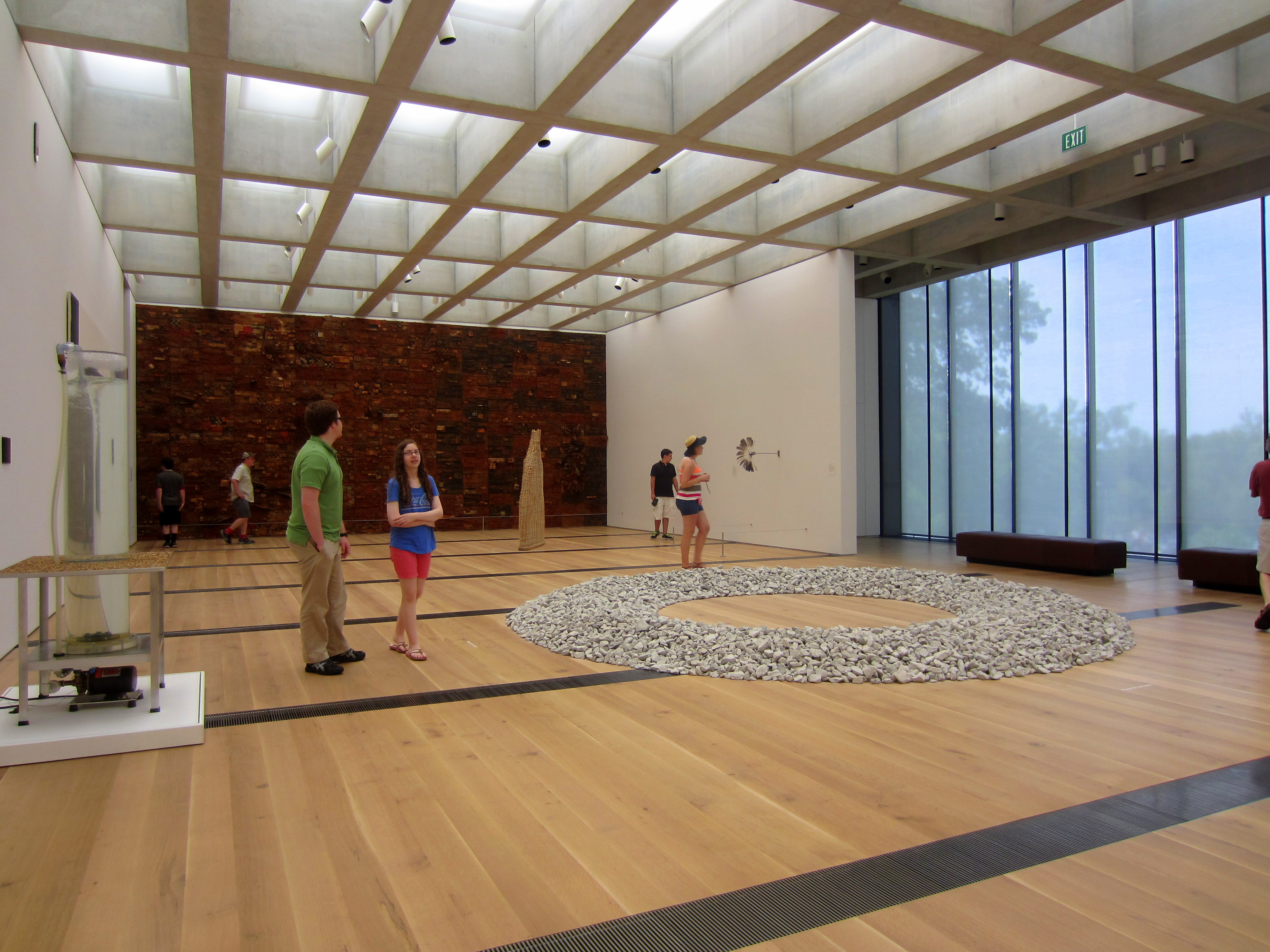
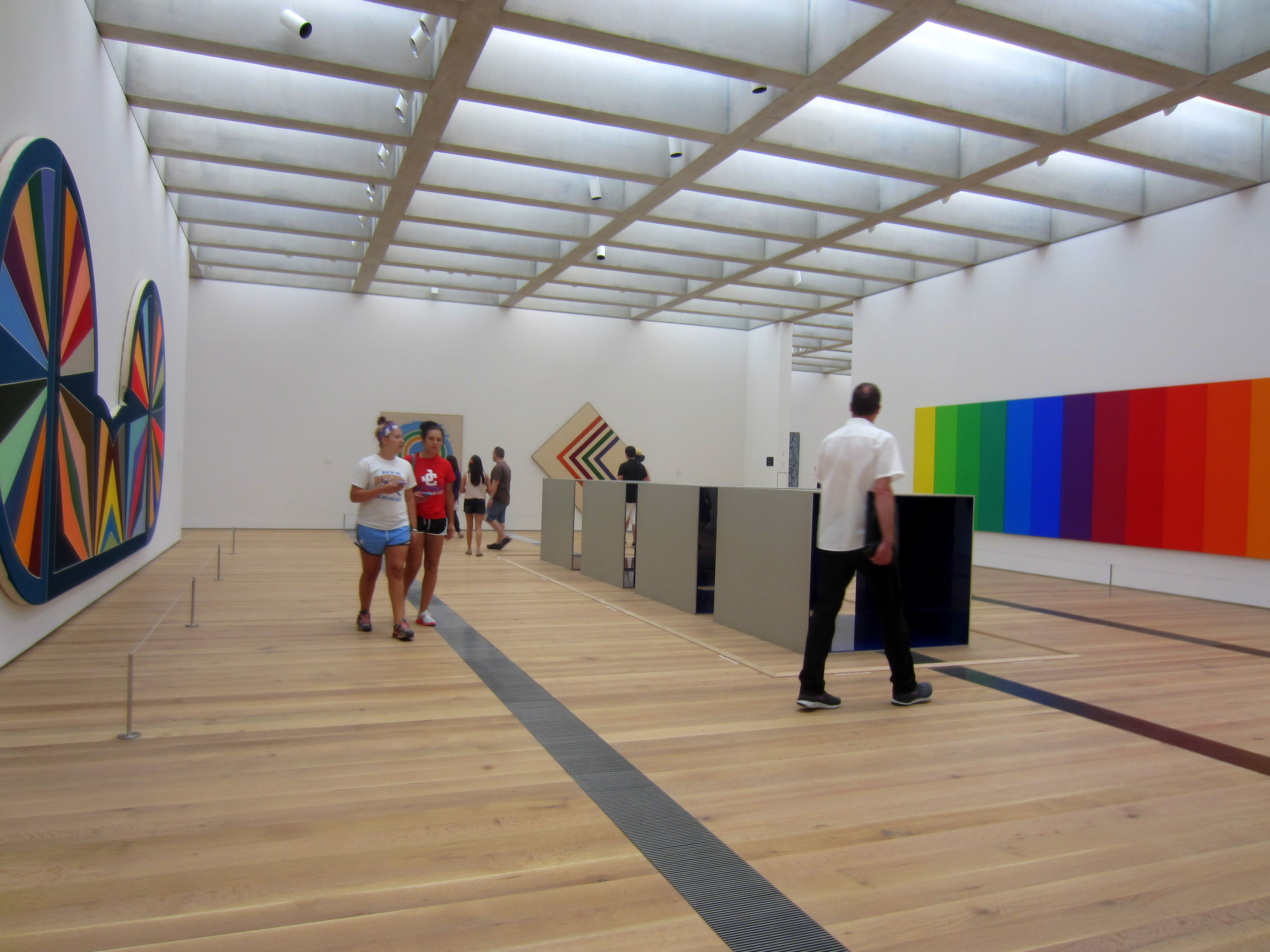
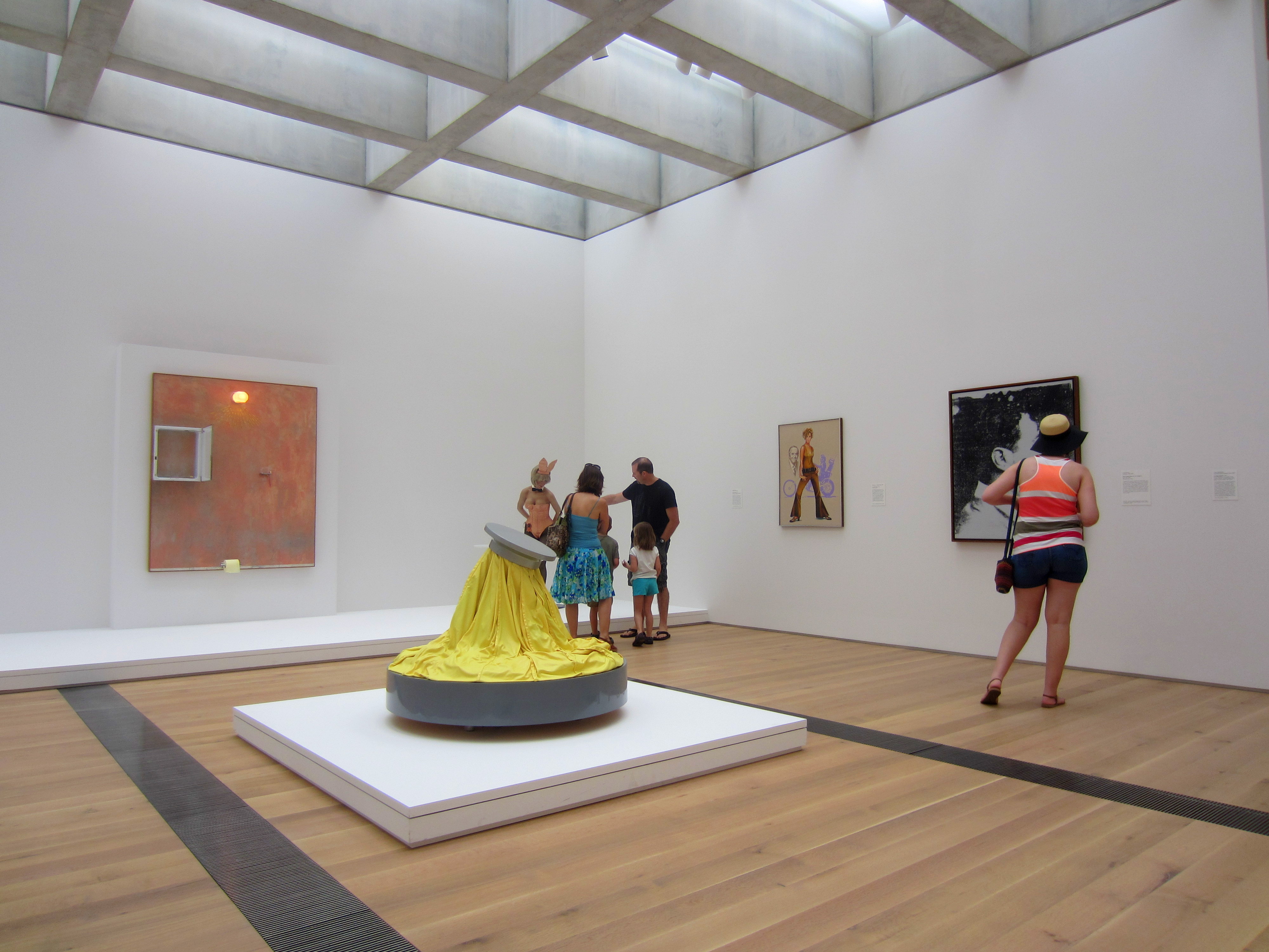
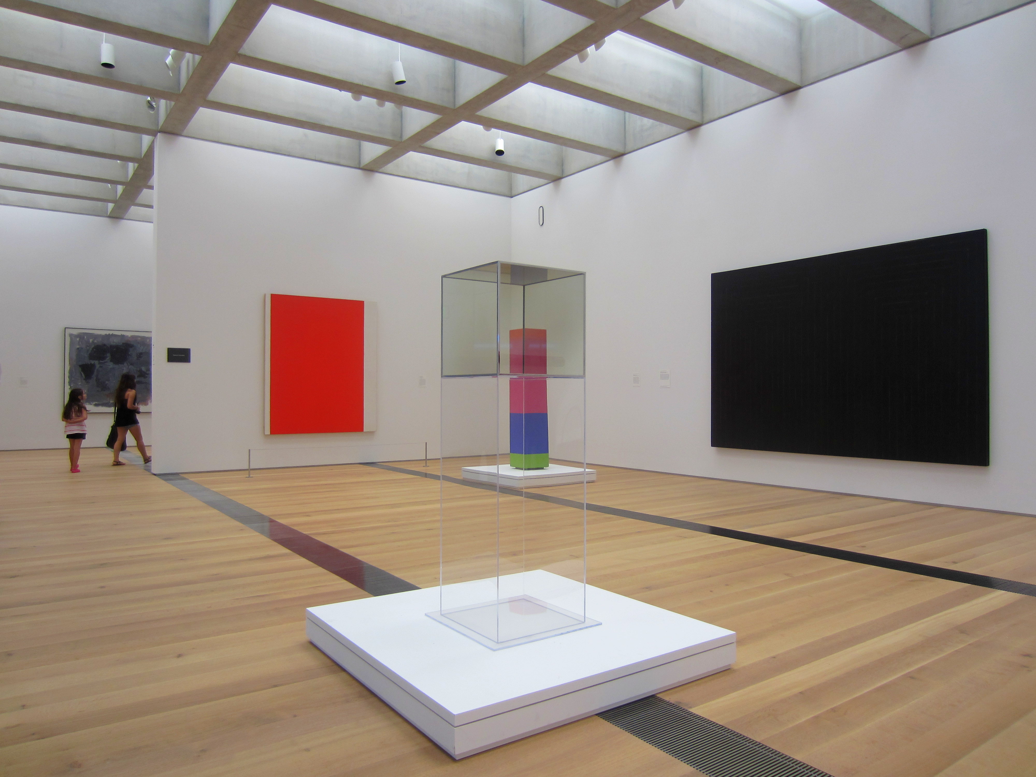
Say what you will about these ceilings — and there are plenty of nice things to say about them — but one thing that don’t do is soar, and that’s a good thing. Paintings, sculptures and installations that are meant to be monumental look that way in here, and those that aren’t don’t disappear into the ether.
And speaking of grand things, a (grand) housekeeping note: Arts + Culture Houston, where I’ve been the visual arts editor for a little over a year, and its (older) sister publication, Arts + Culture North Texas, are officially merging into Arts + Culture Texas and adding coverage in Austin, San Antonio, and other parts of of the state when merited, starting with the September issue. I’ll be handling visual arts and architecture coverage for the new statewide magazine, and Nancy Wozny will handle all things performing/film/etc.-related.
Given the cross-pollination that goes on between Texas’s various arts communities, we think the move makes sense, and we’re excited. Like our new page on Facebook, and fasten your seat belt. This Midwest road trip was just a warm-up.
Tyree Guyton, museum curator
9 JulOne bridge between the art I saw at the Detroit Institute of Arts and the blight I saw elsewhere in the city is artist Tyree Guyton, who has work both in the DIA’s collection:

Tyree Guyton, Rosa Parks, Heidelberg Fragment, 1986. Detroit Institute of Arts
And on Heidelberg Street on Detroit’s East Side. To a Houstonian, Guyton’s Heidelberg Project resembles a cross between Project Row Houses and the kinds of projects supported and maintained by the Orange Show Center for Visionary Art:


Guyton’s been at it since 1986, often with resistance from the city and individuals who, incredibly in the context of the surrounding ruin, view the Heidelberg Project as “an eyesore because of its dependence on recycled materials and those who favor more conventional forms of urban renewal,” writes John Beardsley in a booklet I bought in the gift shop.
Also writing in the booklet, Bradley Taylor, associate director of the University of Michigan’s Museum Studies Program, says:
In our focus on the Heidelberg Project’s unmistakable “otherness,” most have overlooked how closely aligned it is, in fact, to an institutional model that was very familiar to us — the museum. Like museums, the Heidelberg Project maintains collections of artistic merit, offers outreach and educational programs to its audience, attracts visitors who come from a distance to see it, is funded by a combination of grant monies, private philanthropy, and earned income, and is perceived to be an asset of significant value to the community. And, among his many roles, Tyree Guyton serves not only as artist/creator but also as artist/curator, one who cares for his collections and seeks to interpret them to the public. Far more than in any of these superficial similarities, however, it is in the unique integration of the Heidelberg Project in the community that Guyton’s work most closely resembles a museum – a brilliant model that was first promulgated over 100 years ago.

Sunday afternoon yoga at the Detroit Institute of Arts.
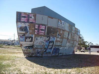
Art/devastation tours, then and now
8 JulOne of my most unforgettable experiences with the intersection of art and the life of a city was Prospect.1, an international contemporary art exhibition intended to assist in New Orleans’s economic recovery from the devastation wrought by Hurricane Katrina and the governmental neglect that preceded and followed it. (Although Prospect New Orleans was intended to launch a biennial, cost overruns and the Great Recession have turned it into a more occasional series of exhibitions. Thee next one, which is to be curated by Los Angeles Museum of County Art chief curator — and former Menil Collection curator — Franklin Sirmans, was supposed to happen this year but was postponed until 2014 so as not to compete with bigger, more glamorous extravaganzas like the Venice Biennale.)
Mark Bradford’s Mithra, 2008, at Prospect.1 New Orleans.
What made the memory so powerful wasn’t just the art but the way Prospect.1 director and chief curator Dan Cameron, who’s now the TK at the Orange County Museum of Art, sited many of the installations in the Lower Ninth Ward and other ravaged areas — the idea being to force biennial-hoppers to confront the lingering wreckage firsthand. I vividly remember the jaded assholes on the press bus, most of whom had forgotten about more art fairs and biennials than I’ve ever attended — becoming a little less jaded and a little less asshole-ish with every stop.
So when I read that Kevyn Orr, the emergency manager for Detroit appointed by Michigan Gov. Rick Snyder, plans to take the city’s creditors on a bus tour of the parts of the city most ravaged by the departure of some 1.2 million residents, I wanted to see some of the areas the Detroit News’s Laura Berman recommended for “a shock-and-awe tour of Detroit that skips the niceties.” What I saw was indeed shocking and all too reminiscent of the post-Katrina Lower Ninth Ward, only on a larger, seemingly infinite scale. Here’s hoping Orr’s tour also makes Detroit’s creditors a little less jaded and a little less asshole-ish at every stop and, as Berman puts it, jolts “hard-nosed creditors out of balky reluctance and into accepting his offer of a settlement: More or less, 10 cents on the dollar.”

In my Facebook photo album, I’m alternating snapshots I took from my self-guided tour with some I took at the Detroit Institute of Arts, whose truly world-class — to borrow a term many Houstonians cringe-inducingly use in every other sentence — collection Orr has eyed for the auction block, because ultimately I can’t separate the memories.
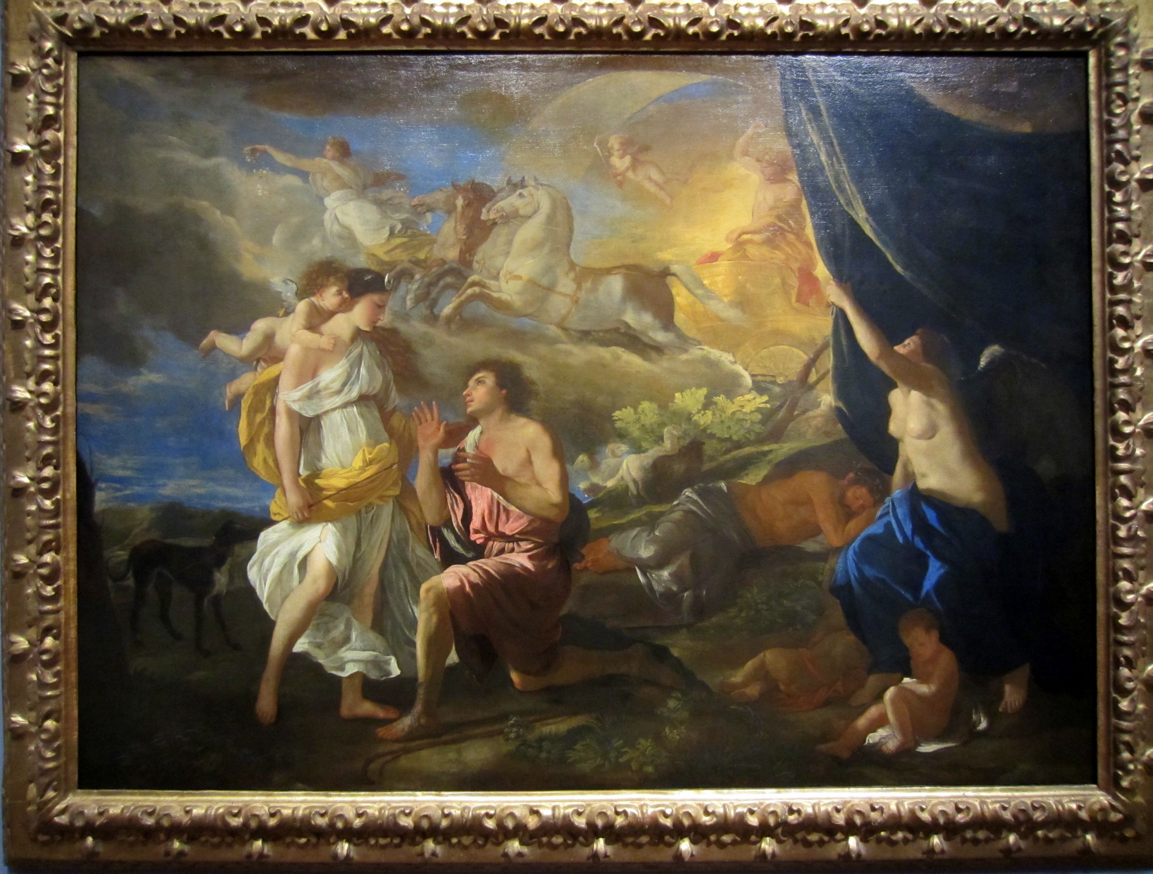
Nicolas Poussin, Selene and Endymion, c. 1630. Detroit Institute of Arts
From Toby Barlow’s article brilliantly explaining why the banks, not the DIA, should be the ones forced to sell art from their collections:
Over the past decade, the banks have evicted many, many people in Detroit from their homes. …
After these evictions occurred, the banks did not foreclose the homes. They simply let the houses rot.
In other words, as opposed to following the due diligence of a functioning system, wherein these banks would have gone through the legal process of actually foreclosing the home, earning back the home’s title, and then paying the taxes on the property until the property was sold to a new owner, they did nothing. They simply walked away.
So, for starters, they owe taxes on those homes. Not just a few homes; thousands of homes. That’s lot of taxes. When you’re done adding everything that’s owed, it’s probably worth more than a few Chagalls.
Then there’s this: by letting those homes rot, these banks caused the depreciation of all the other homes in all those neighborhoods, block after block, along nearly every avenue, street and boulevard. Each one of these abandoned homes pulls the value of all those other buildings down.
These banks were like the shark in Copley’s famous painting (at the Detroit Institute of Art, of course), attacking the vulnerable drowning figure in the water.

John Singleton Copley, Watson and the Shark, 1777. Detroit Institute of Arts
The victims were honest and hard working, and their homes were suddenly worth less. What followed was predictable: a shrinking tax base, the city unable to pay its bills, cut services. So now the police don’t show up, the firemen are understaffed, people are less safe, people move away, more homes stand empty, and the banks didn’t know or didn’t care. Having made the money they were going to make, they simply swam on.
Architecture for art’s sake
3 JulAfter revisiting the Nelson-Atkins Museum of Art and loving its collection but its starchitectural addition not so much, I couldn’t have picked a better follow-up than the Minneapolis Institute of Arts, which, like the Nelson-Atkins, has a grand neo-classical original building, designed by McKim, White and Mead that has posed a challenge for expansions. You don’t don’t want new wings competing with, or overshadowing this:

Well, not only does the 2006 addition by Michael Graves, which expanded upon both the 1915 building and Kenzo Tange’s minimalist 1974 addition, not compete with the original, it dares to be dull in a way that drew yawns from critics like Blair Kamin when it first opened:
Some neighbors of the museum liken his addition to a mausoleum or a big-box store, a not-so-veiled shot at the wing’s chief sponsor, Minneapolis-based Target Corp. (which also happens to pay the Princeton, N.J., architect to design household products). Indeed, Graves’ mostly windowless expanses of stone turn a forbidding face to the street.
Good point about the apparent conflict of interest with Target.
His main entrance facade is better, its limestone walls, with their niches and thin columns, simultaneously conveying the weighty feel of stone and the lightness of folded paper.
The interior also has its moments, like a barrel-vaulted reception hall that reveals Graves’ talent for enlivening traditional forms with rich materials and colors. But, at root, it’s flawed, the result of a clash in sensibilities between Graves’ postmodernism and the modern spirit of the museum’s curators.
The curators, who furnished the second- and third-floor galleries chiefly housing 20th Century and contemporary art, faithfully continued the crisp aesthetic of the museum’s existing galleries, but at a price. They insisted, for example, on no natural light, a disappointing contrast to Renzo Piano’s planned new wing at the Art Institute of Chicago.
I wonder if Kamin would care to take those words back today. You hardly ask for a better example of what the obsession with natural light has done to museum architecture than the Piano wing at AIC. Kamin concluded:
The result is a generic collection of rooms, handsome when considered individually, but nothing special as a suite. Much the same can be said of this project as a whole: It’s burdened with compromises — classical, but no classic.
Marianne Combs’s Minnesota Public Radio piece, while also noting the Target conflict, gets the real point of the expansion:
To understand the impact of the new wing, consider the museum’s textile collection. Curator Lotus Stack oversees a collection of more than 10,000 textiles, but she’s been able to hang only a few of those pieces at a time in the institute’s hallways. Now she has four entire galleries to herself.
“It feels like I’ve landed in Utopia, I mean what else can you ask for?” laughs Stack. “It is a frustration of probably every curator, some more than others depending on the size of your collection — how much you can share with people, not only to represent the collection, but to give it context to give it greater meaning and relationships. And exhibitions, after all, are about relationships. The whole building is that way, so it’s thrilling for us all.”
The MIA’s expansion has had a ripple effect throughout the building. Every gallery has been reorganized, the art re-hung. As a result, the paintings, sculpture, and prints that adorn the MIA’s now 143 galleries seem to breathe more easily.
Then-director Bill Griswold and trustee Martin Weinstein had this to say to Combs about Graves’s addition:
Griswold says Graves successfully melds the neoclassicism of the MIA’s original building with the modern minimalism of the 1970s addition. But more important, Griswold says, Graves has created a space that allows the MIA to be even more dynamic and aggressive in its programming and its community outreach. Martin Weinstein says while he’s not totally pleased with the new exterior, he’s not too concerned about it.
“You’re not going to stand outside and look at the building too much, says Weinstein. “You’re going to be anxious to run inside and see what they have for you to see — the artwork.”
Weinstein says many museum expansions end up being all about the building. In the case of the MIA, he says, the expansion is all about the art.
In fact, it was only in the 1915 building’s too-grand hall housing 16th- and 17th-century Italian paintings that I noticed the architecture intruding on the art. There’s lots of wall space, but it’s mostly vertical, so monumental paintings are hung on top of one another, rising to the sky-high ceiling. I want to get up close and personal with Salvator Rosa’s St. Humphrey (Onuphrius) (c. 1660), not jockey for position to avoid the glare. There’s a reason for the weird distortion in my snapshot of what, as best I can tell, is a fantastic painting, because the only way to photograph it — and to see it — is to look up, way up.

Never mind whatever was hanging above it. Meanwhile, get a load of this Max Beckmann and tell me if think it suffers from a lack of natural light:

Max Beckmann, Blind Man’s Buff, 1945. Oil on canvas. Minneapolis Institute of Arts
Do we really wish it was hanging next to something like this just to satisfy architects’ natural-light fetish?

Steven Holl Architects, who will design the Museum of Fine Arts, Houston’s modern-and-contemporary building, made a lovely building for the Nelson-Atkins, but all the compromises were made by the art that’s inside and that takes forever to find. With Graves’s addition to the MIA, the compromises were made by the architect — and, no doubt, his ego — but the art shines, not just in his wing, but throughout the building. Back to Weinstein:
Weinstein says viewers should feel good inside the museum, even as they’re challenged by the art. The space should enhance their interest, and their ability to remember what they’ve seen. Weinstein says he experienced this himself, with a 17th-century portrait of the virtuous yet ill-fated Lucretia.

Rembrant Harmensz van Rijn, Lucretia, 1666. Oil on canvas. Minneapolis Institute of Arts
“I sat down in my most recent tour and just looked up at Rembrandt’s painting of this sweet, innocent young woman, and I was so taken with it,” says Weinstein. “I think that’s one of the best Rembrandts anywhere. I don’t think I ever focused on it as much as I did this last time.”
I’ll have more to say about the MIA’s mind-bogglingly good collection — see my Facebook photo album, which I’ll continue to add to, here — and how the museum works to engage viewers with it soon. For now, on to the Walker Art Center.
Empty white spaces, red marble satyrs
2 JulIf you missed Jerry Saltz’s utterly on-point Facebook rant about museum starchitecture, which was prompted by Steven Holl Architects’ acclaimed — though not by Saltz — 2007 addition to the shockingly wonderful Nelson-Atkins Museum of Art (he loves the museum but hates the addition), read it, especially if you care what happens when Holl and crew design the Museum of Fine Arts, Houston’s new modern-and-contemporary art building. And be sure to click on the pictures he took of the interior of the Bloch Building, like this one:

The Bloch Building’s interminable airport terminal-style lobby. Photo: Jerry Saltz
There’s a reason Google Image searches on “Steven Holl Nelson Atkins” overwhelmingly turn up renderings of the building’s exterior, which has rightly been praised for the unassuming manner in which it connects to the Nelson-Atkins’s 1933 classical temple-of-art building. The problem, as Saltz notes, is that once you get inside, the “Bloch is all lobbies, ramps, ridiculous angles, emptiness, atria, and almost no art. I walked more than two football fields to reach the art. And this space is three floors tall. …”
As with Renzo Piano’s giant lovely atrium-filled addition to Chicago’s great Art Institute – a space fit only for pharaohs, trustees, architects, and parties, a space all but empty of art for thousands of square feet of three vertical floors – at the handsome Bloch we get white spaces, corridors, construction details, slivers of window here and there, but NO art in sight. It’s more like an airport or a mall. There should be 50 to 60 works here – even if the space isn’t built for art.
And let’s face it, it really isn’t built for art. The most important painting in this gallery, for example, Willem de Kooning’s knockout Woman IV (1953), gets swallowed by the space (it’s on the back wall):

… and for some reason hangs adjacent to a small staircase leading up to a window that looks into the airport/mall you thought you’d finally escaped.
Granted, the de Kooning is large but not monumental — but that’s just another way of saying that it made more of an impact in the old building. In fact, since the MFAH abandoned the clusterfuckery that used to characterize its Ab-Ex-and-friends gallery, its abstract expressionist presentation is more powerful than the Nelson-Atkins’s, even if some minor-work creep has returned to the MFAH gallery since I wrote this article hailing the welcome changes to the space. (One hopes that’s because a chunk of the MFAH’s American holdings are currently traveling across South Korea.) And the MFAH’s big, dark Rothko makes the Nelson-Atkins’s Rothko look like a non-entity.
All that said, there’s some great stuff in the Bloch Building including this Richard Diebenkorn, this Fairfield Porter masterpiece, this classic Tom Wesselmann, and this:

Kerry James Marshall , American , b. 1955 , b. Birmingham, AL. Memento #5, 2003. Acrylic and glitter on paper adhered to unstretched canvas banner. 9 feet x 13 feet (274.32 x 396.24 cm). The Nelson-Atkins Museum of Art. Purchase: acquired through the generosity of the William T. Kemper Foundation—Commerce Bank, Trustee
But for me, the best thing about the Bloch Building — and a key factor distinguishing it from whatever Holl comes up with for the MFAH — is that, in addition to allowing the Nelson-Atkins to show works that would otherwise sit in storage, it frees up at least some room in the old building to show even more art from its incredible collections (I’ve got tons of photos on Facebook). In the Nelson-Atkins’s main building, you run into fantastic art no matter where you turn, including this great red marble sculpture on loan from Rome’s Musei Capitolini through Sept. 29:

Fauno rosso (red satyr), Roman, 117-138 C.E. Red marble. On loan from Musei Capitolini, Rome

Standing in the presence of this red marble satyr, all peeves about the Bloch Building and starchitecture just melt away. That said, here’s hoping Holl’s approach for the MFAH, which hasn’t had the greatest luck with buildings, is to let grand architectural statements play second fiddle to the art instead of the other way around.
Laura McPhee: Worth the fossil fuels
1 JulThere’s nothing like flying to the beginning of your road trip to feel like you’re not only cheating — like a marathoner taking a cab to the midpoint of the race — but maximizing your carbon footprint. So perhaps it’s fitting that the first art I laid eyes on in Kansas City (after flying from Houston to St. Louis, where I rented my car) was Laura McPhee’s extraordinary series River of No Return, which is on view through Sept. 22 at the Kemper Museum of Contemporary Art.
Laura McPhee, Judy Tracking Radio-Collared Wolves From Her Yard, Summer Range, H-Hook Ranch, Custer County, Idaho, 2004; chromogenic print, 94 x 72 inches; Collection of Alturas Foundation and courtesy of Carroll and Sons, Boston, ©Laura McPhee
Using an antique 8-by-10-inch camera, McPhee shot the monumental photographs — each measures six by eight feet — in the Sawtooth Valley of Idaho during 2003-2006 as the initial Alturas Foundation artist-in-residence. (She’s interviewed about the series by Kemper curator Erin Dziedzic on this podcast.) The series poetically documents the complex interactions of various humans — ranchers, hunters, environmentalists and recreationists — with the vast landscape, and more subtly with each other. As such, the series extends the thread of her work with which I was previously most familiar, photographs she made in collaboration with my former teacher Virginia Beahan, with whom I took an unforgettable intermediate black-and-white photography class at the School of the Museum of Fine Arts, Boston back in the 1990s.
Beahan, a powerful presence with a booming voice, couldn’t remember my name, even when it was much more low-maintenance than it is now, until the end of the continuing-ed course. But when I presented my bad-Robert-Frank-meets-bad-Nan-Goldin photos that I’d slaved over all semester together with text passages I’d written the night before, she read every word, took off her glasses and seemed to look at me for the first time. Then she tried to talk me into going to RISD so I could develop my writing through cross-registration with Brown University. I ended up matriculating at MassArt instead because it was so much cheaper, and that’s where I met McPhee, who’s a professor there. I wasn’t around long enough to study with her — I got it in my head that I had to move to San Francisco before I turned 30 — but she joined my color photography teacher Barbara Bosworth to critique our final presentations. This time I presented bad-Nan-Goldin-meets-worse-Nan-Goldin photographs I’d slaved over all semester together with text passages I’d written the night before. McPhee, like Beahan, raved about the writing before adding: “I just wish the photographs were better.” You and me both, McPhee. You and me both.
I can’t say the same about her photographs, which were thrilling to see in person. Like the landscape she documents and the issues surrounding it, they’re bigger than you are and are perhaps most achingly beautiful at their most frightening. I just wish my writing about them was better. Maybe if I’d taken Beahan’s advice and gone to RISD it would have been.
Turrell in heavy doses
28 JunKelly Klaasmeyer‘s and Rachel Hooper‘s takes on James Turrell: The Light Inside at the Museum of Fine Arts, Houston both praise the show overall while raising issues about constrictions the retrospective format — and in some cases, Turrell himself — impose on viewers’ experience of his work.

James Turrell, ‘Rondo (Blue),’ from the series Shallow Spaces, 1969, neon light, the Museum of Fine Arts, Houston, gift of the estate of Isabel B. Wilson in memory of Peter C. Marzio. © James Turrell
Klaasmeyer notes the duress required to experience the show’s most all-consuming installation, End Around (2006) from Turrell’s Ganzfeld series:
Getting into End Around is not unlike going through airport security. You wait in a roped-off line until the guard lets you enter the anteroom to the installation. In the anteroom, another guard points you to a pile of paper booties. The MFAH is requiring you to remove your shoes and wear the booties directly on your feet. I understand that the museum is trying to maintain the pristine white floors of End Around, but may I just say that having large numbers of Houstonians taking their shoes off in the heat of summer is a horrifically bad idea. The entry to Turrell’s stunning, otherworldly environment smells like a freaking locker room. Seriously.

James Turrell, ‘End Around: Ganzfeld,’ 2006, neon and fluorescent light, (2007 installation at Pomona College Museum of Art, Claremont, California), the Museum of Fine Arts, Houston, gift of the estate of Isabel B. Wilson in memory of Peter C. Marzio. © James Turrell / Photograph by Florian Holzherr
Klaasmeyer also addresses the control-freak factor inherent in presenting Turrell’s work in secular institutional settings:
Maybe it’s because the show just opened, but the MFAH’s host of apparently newly hired twentysomething guards seemed to go beyond protecting the work and the visitors to micromanaging their experience. There are always rules with art; the open-air pavilion of the Twilight Epiphany skyspace at Rice University doesn’t allow food or drink or talking or cameras after the show starts, and quite rightly so. But it also doesn’t allow anyone to lie on the inviting, grassy slope that surrounds the pavilion, as one student attempted to do. I don’t know if this is Turrell so much as it is the keepers of his work. I just wish viewers were allowed a little more leeway to be human. Perhaps the Live Oak Meeting House is a perfect situation. In a place of worship, you expect to be quiet, sit still on a bench and be reverential. And in fact, the Quakers are the most relaxed and welcoming keepers of the Turrell sites I have visited. They invite viewers to get up and walk around and children to lie on the floor to view the skyspace. On a recent visit, I observed practically supine couples lounging on the padded church pews, contemplating the darkening sky.
Meanwhile, Hooper calls the retrospective format into question. Is more-is-more really more when it comes to Turrell?
The exhilaration of a Turrell installation can be addictive, and the retrospective promises the ultimate fix of awe-inspiring harmony between vision, emotion, and light. But seeing many of the artist’s works gathered together in one place had the surprising effect of diminishing rather than enhancing the force of the artworks. The cumulative effect of the retrospective does not leave as powerful of a visual impression as the individual installations. The whole is not equal to the sum of its parts, which is a challenge not only for the visitor’s experience but also the common assumption that perception is all that there is to a Turrell. …
The unintended consequence of the optical intensity of works like End Around is that his small scale projections and tall glasses fall flat in comparison. An understated work like the linear Rondo (Blue) (1969) might be stunning on its own, but with other more immersive spaces close at hand, it seems like merely a teaser or sketch for the larger works. Turrell’s tendency to outdo himself makes it hard to see each installation unto itself. His spaces are at their worst when measured against his greatest achievements, and his ambition knows no end.
What sets the MFAH’s Turrell show apart from the Los Angeles County Museum of Art retrospective and the Guggenheim’s exhibition is that the MFAH owns all the Turrells it’s showing, which only represent about half the installations in its collection. (This is thanks largely to the late Isabel Wilson, a former Houston Post reporter who, when I once sat next to her at a society function, regaled me with stories of climbing stairs in the federal building to get her scoops and fighting off ass-grabbers in and out of the newsroom. That’s not where her money came from; she was a daughter of industrialist George R. Brown.) Which does raise the question of why the MFAH felt the need to present so many Turrells at once instead of, say, rolling them out in smaller doses throughout the year. Was it really necessary to synchronize the timing with LACMA and the Guggenheim?
Not that I want to complain too strenuously. Like Hooper, I found the heavy concentration of Turrells in the Mies van der Rohe-designed Upper Brown Pavilion — which presents its usual share of thorny-to-insurmountable exhibition-design challenges along with its grace notes — unexpectedly enhanced my appreciation of The Light Inside (1999), the walk-through Turrell in the Wilson Tunnel that connects the Law and Beck Buildings. Hooper:
The experience of one Turrell after another like this drove home how radically I was letting go of my other senses in order to experience his work. The alienation from any physicality outside of my eyes started to disturb me. In this respect, I gained a newfound appreciation for the namesake of the exhibition, the tunnel that runs between the Law and Beck buildings at the MFAH. I seem to always strike up a conversation there and enjoy the change of perspective when walking from one end to the other. I now understand how exceptionally social and physically present I feel in that place.

James Turrell, ‘The Light Inside,’ 1999, neon and ambient light, the Museum of Fine Arts, Houston, Museum commission, gift of Isabel B. and Wallace S. Wilson. © James Turrell
In that sense, maybe there’s something to be said for experiencing the oppressive side of Turrell; perhaps doing so better helps us appreciate what we find special in our happier encounters with his work. Still, once the hoopla of the summer Turrell extravaganza has died down, I hope the MFAH doesn’t let its other Turrells languish in storage, but instead unveils a new one on a semi-regular basis. In the meantime, MFAH members or those who go on free days to bypass the $13 general admission fee (the MFAH retrospective is also the cheapest of the three presentations to visit) should consider going back multiple times over the summer to take in a Turrell or two at at time. I’m also determined to get up early enough one of these mornings to watch Twilight Epiphany at Rice greet the day instead of bidding it farewell.
